![]() Available to users with the Dashboards read system permission in their role.
Available to users with the Dashboards read system permission in their role.
Dashboards are highly customized, interactive reports designed to make data more accessible and visually meaningful for members of your organization. These dashboards can be built either by a Teamworks Product Success Manager, or by people in your organization who have permission to set them up. Dashboards can be designed for different types of Teamworks AMS users, including coaches, athletes and anyone else who interacts with AMS. They can display data from any number of event forms that exist in the site to give people quick and easy access to all of the most relevant information to them.
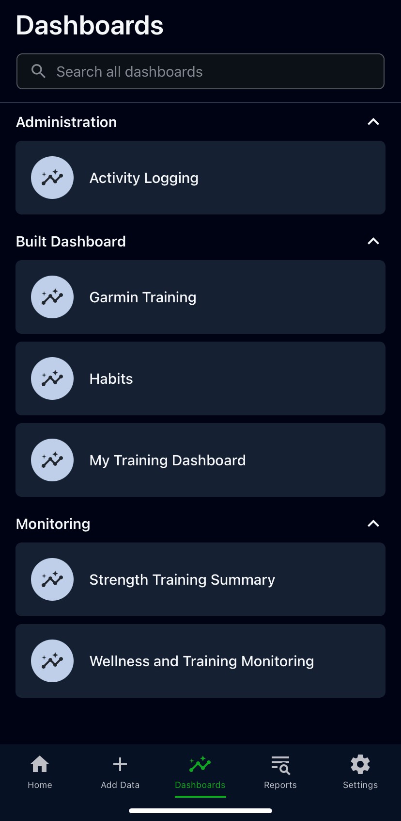
If you have access to any dashboards, you'll be able to locate them under the Dashboards tool from your home screen. This may be accessible in the navigation bar and/or as a button on your front page. You may also be able to view dashboards on your AMS home page, depending on what permissions and settings are assigned to your account.
Your site may also display some older D3 (data driven documents) dashboards developed by our team. D3 dashboards are unique reports, dependent on very specific datasets and are not a tool that can be modified by AMS users (or builders).
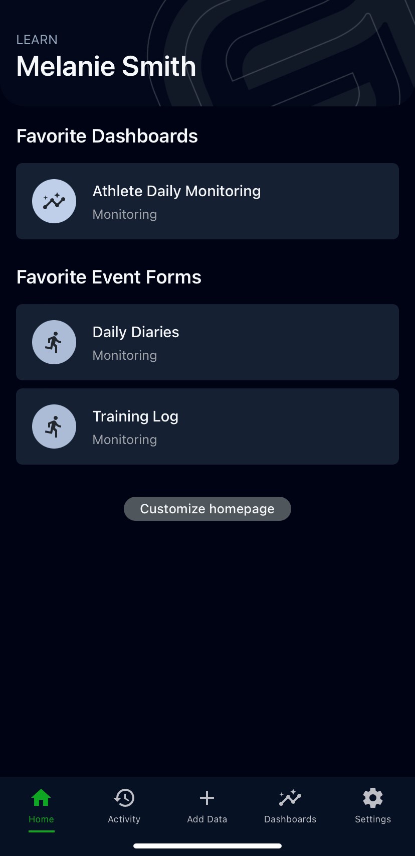
On the AMS app, you can view any dashboards that you have access to through the Dashboards tab. Alternatively, you can select from your Favorite dashboards on the Home tab if you’ve enabled the widget in your customized home screen layout.
Components of a dashboard
Once you’ve opened a dashboard, there are several ways you can interact with it. These interactive features will enable you to narrow down the data you’re looking at, as well as find further information than what’s visible on the dashboard itself.
Canvases
A dashboard can contain one or more canvases, which act like different pages. If more than one canvas is available, you will be able to navigate between them by clicking on the headings at the top of the dashboard.
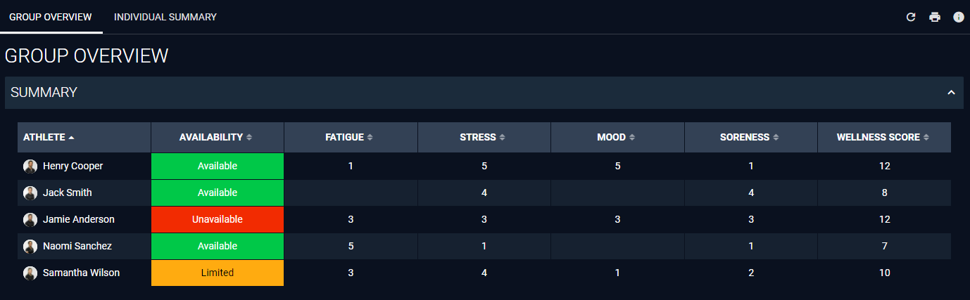
This example dashboard consists of two canvases: GROUP OVERVIEW and INDIVIDUAL SUMMARY. The GROUP OVERVIEW canvas is currently being shown.
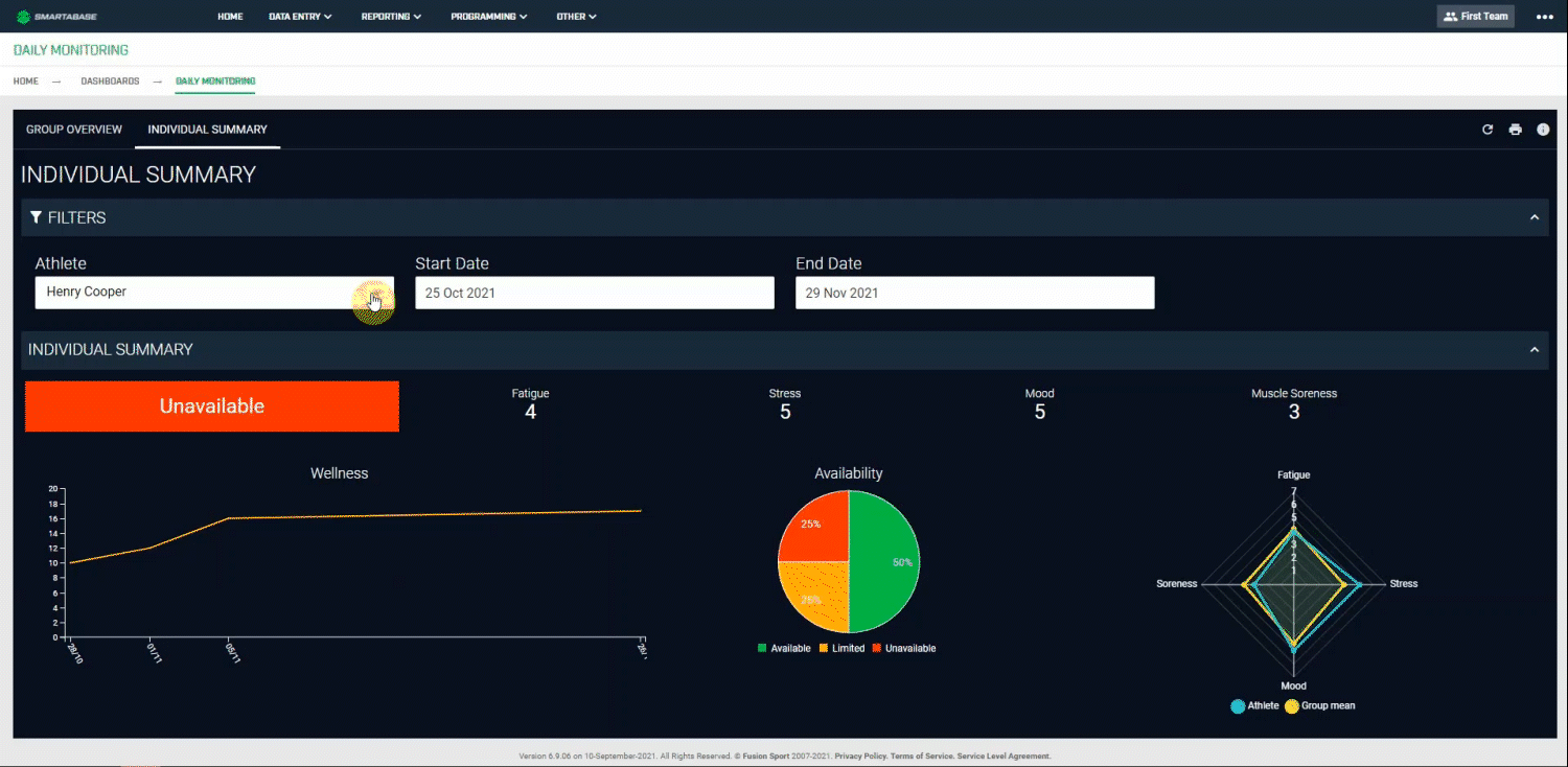
Sections
Sections are used to separate the information within a canvas. A section can be collapsed or expanded by clicking on its header bar, which can be useful when viewing a dashboard with several sections.
In the screenshots above, the FILTERS section has been expanded and collapsed to show or hide the filter widgets.
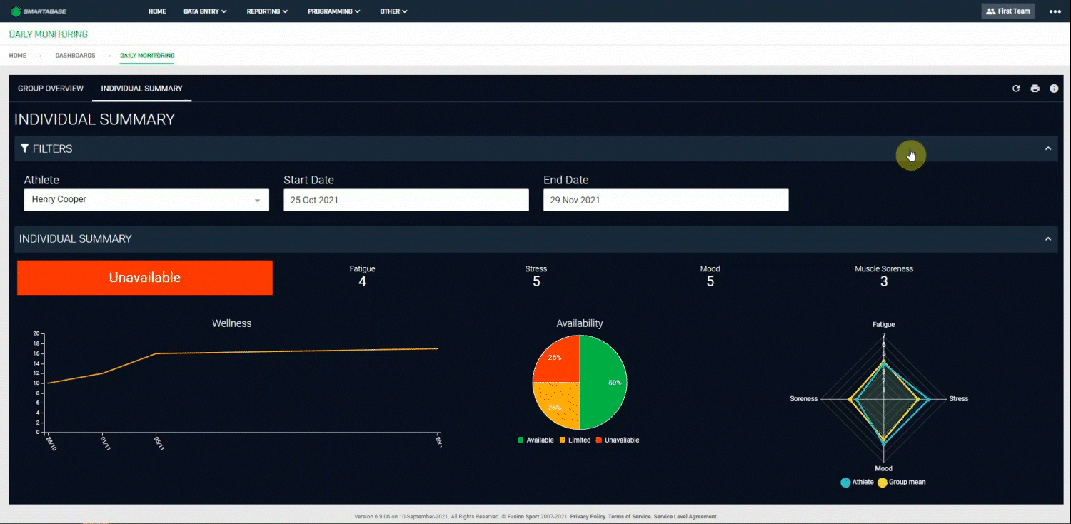
Filter widgets
Most dashboards will have one or more filters included, normally at the top of a canvas or section. Filters can be used to specify exactly which data is displayed on the dashboard, related to the date or details of the records available. There are two types of filter widgets:
- Date picker filters allow you to select dates, often set up in pairs allowing you to choose a start and end date (or date range) for your dashboard.
- Select box filters are used to group data with a similar result for specific fields. You may be able to filter the dashboard by an athlete, sport, year, season round, status or any other field.
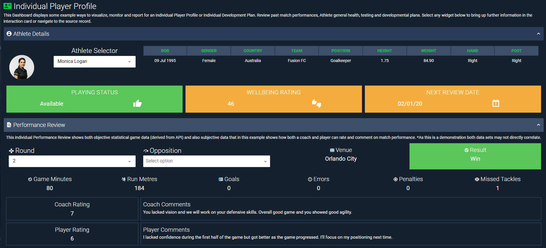
In the example above, the Athlete widget is a select box filter and the Start Date and End Date widgets are date picker filters. The dashboard has been configured such that when you change the selected athlete and date range, the data shown in the widgets within the Individual Summary section is adjusted to meet these parameters.
Data widgets
Several types of widgets can be used to display data in a dashboard. These include tiles, tables and several types of charts, and each widget will be set up to visualize data in the most appropriate way to communicate the necessary information. When hovering over a data series on a chart widget, you may be able to see a tooltip. Some charts may also have a zoom and/or sub chart feature, which allow you to zero in on a smaller portion of the whole data set.
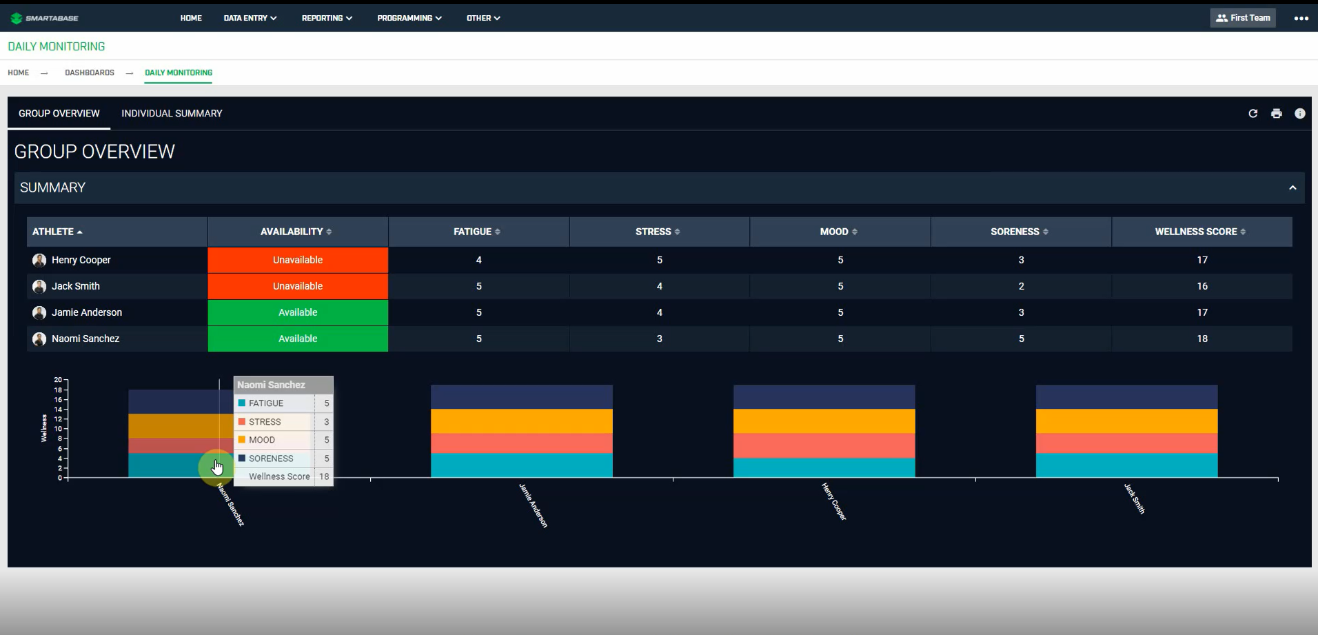
The dashboard in the example above consists of a table to show each person's most recent availability status and wellbeing scores, and a chart to show the wellbeing scores for each individual in a more visual format. Hovering over the bar in the chart shows the individual scores for each metric.
Record cards
If enabled, clicking on a widget will bring up additional information about its source data. If data from multiple records is populating that widget, you will first see a list of all of those records, from which you can choose an individual record to display its record card.
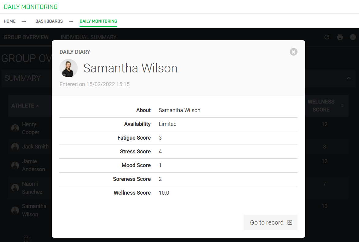
Record click-through
From a record card, you may also be able to click through to the record itself. This can be a valuable tool for getting more context on top of what’s available in the dashboard. If you click through to a record, saving will return you to the dashboard, which will display updated information based on any changes you made in the record.