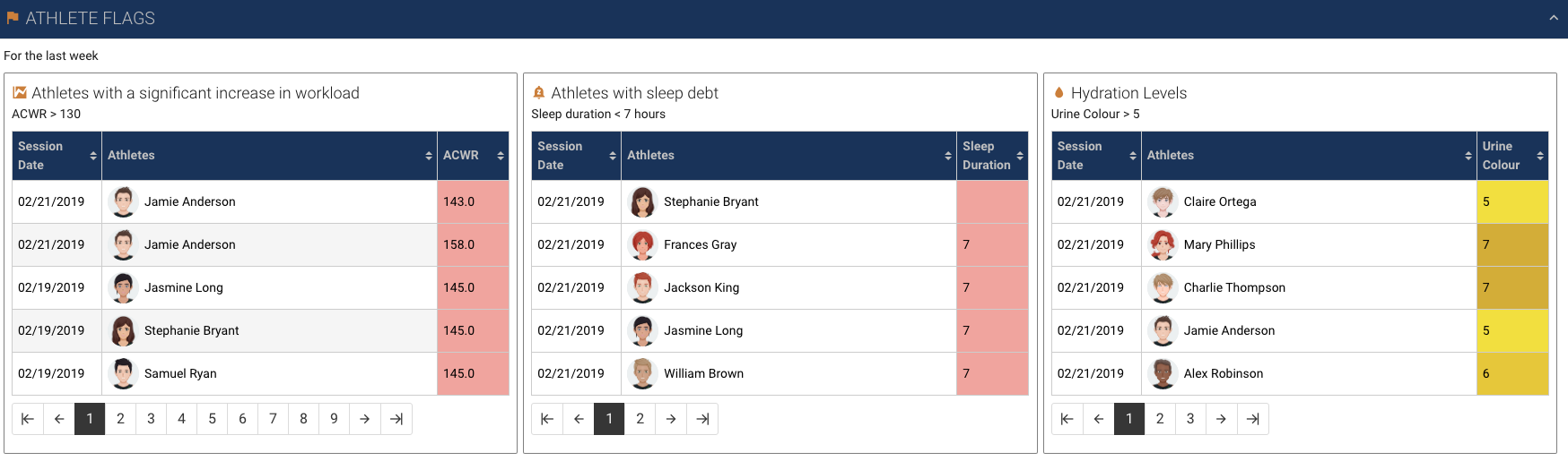
You can use the Table widget to create a report within your dashboard. This widget can display data from one data source as multiple columns.
Select the Table widget to display the settings in the sidebar. These settings include:
- General
- Instructions
- Data
- Columns
- Summary rows
- Style
- Avatar settings
- Sorting
- Interaction
- Advanced properties
- Data preview
- Trellis
General
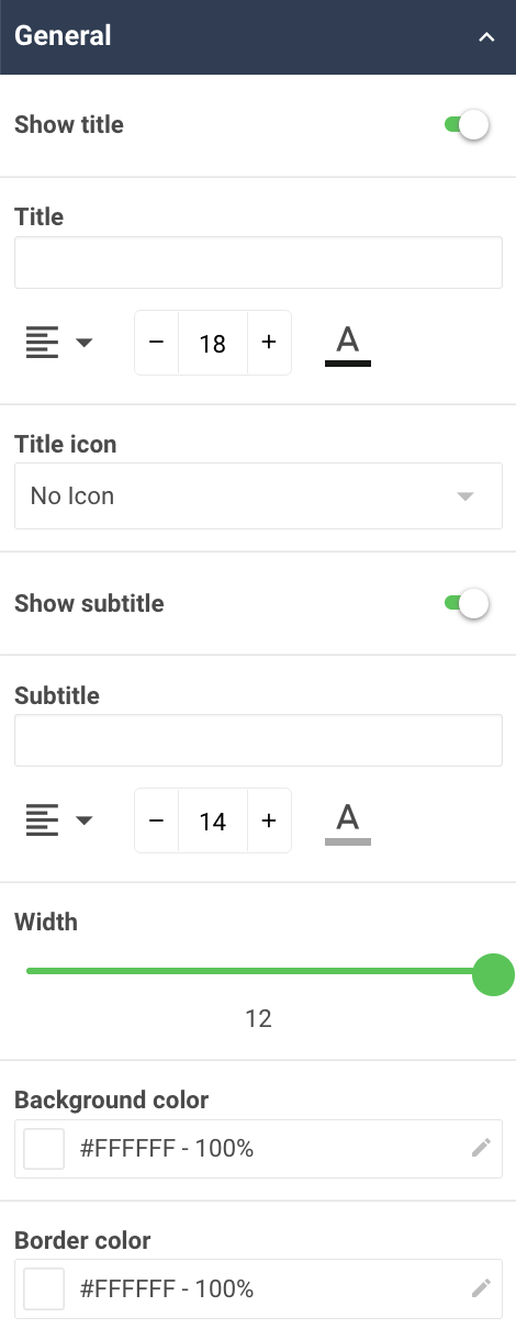
Use the General properties of the sidebar to add descriptive information for your widget. You can also:
- Choose whether the title of the widget should be displayed. If you enable this, then you can provide a Title and Title Icon for the widget and specify the font size, font color and text alignment.
- Choose whether a subtitle for the widget should be displayed. If you enable this, then you can add a Subtitle for the widget and specify the font size, font color and text alignment.
- Specify the Width of the widget within the section where it appears.
- Choose the Background color and Border color for the widget.
Instructions
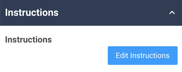
Here you can add static informational content which will appear below the title of the widget. This can include text, images, tables, links and other common content tools.
Data
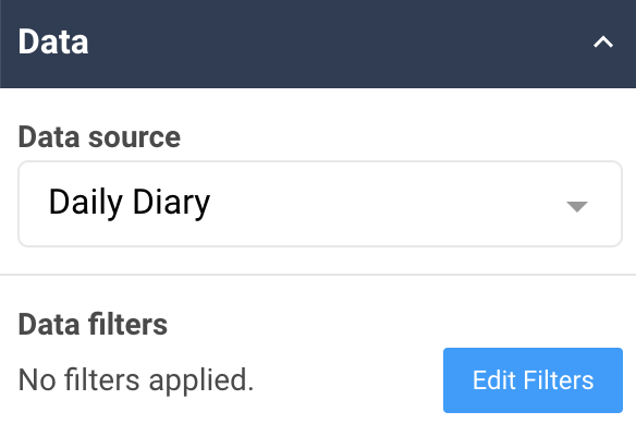
To connect your widget with a data source, use the Data properties to add and filter the value that the widget will display.
Columns
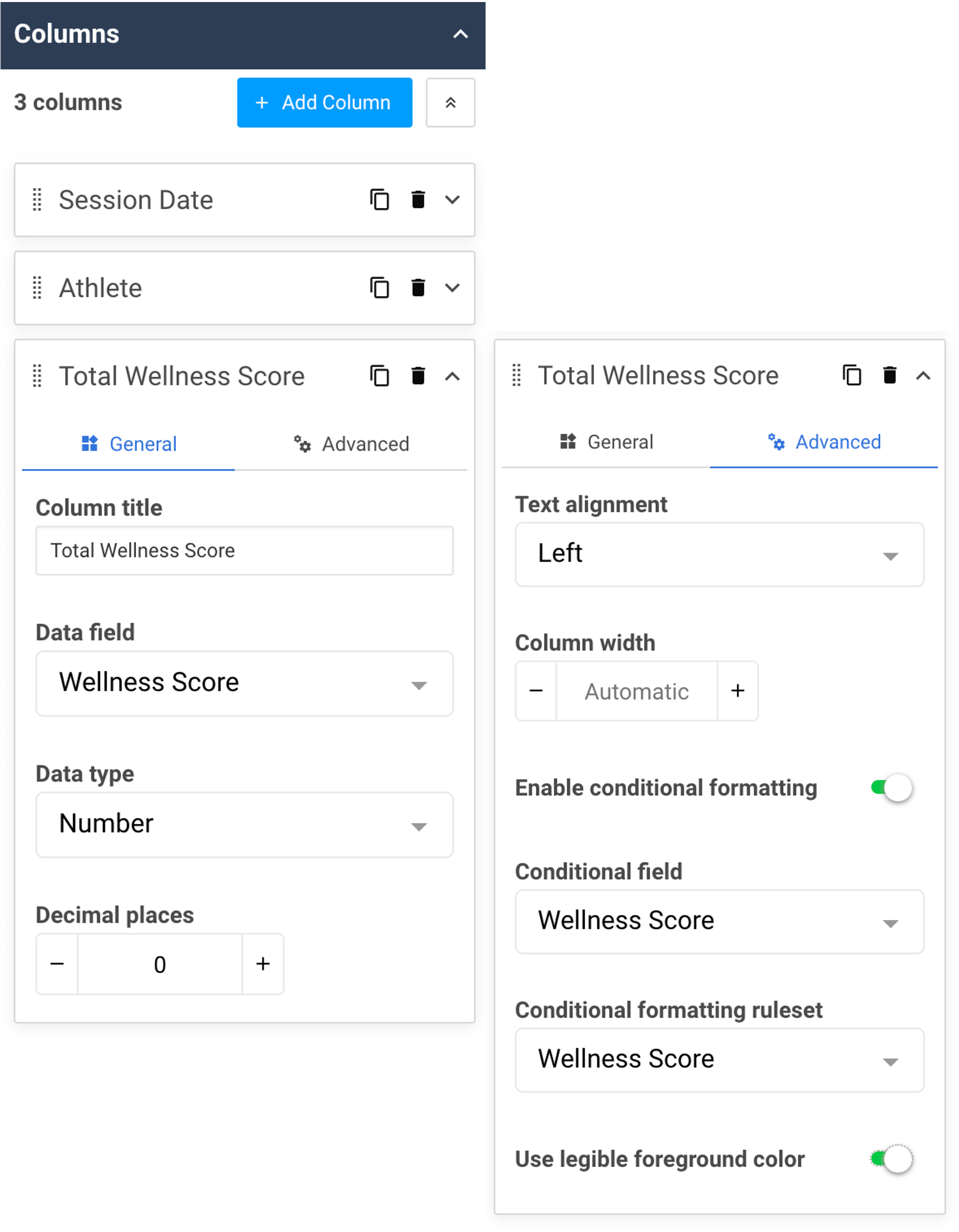
Use the Columns properties to select the information you want to display as different columns. For each column you add to the table, you can:
- Provide a Column title.
- Choose a Data field from your data source.
- Choose the Data type that you want the field to display as. You can choose from Date, Number, String or Image. If you select the Image data type (which will display an image field from an event form), clicking on the image will also expand it to full-screen.
- Depending on the data type selected for your column, you can adjust the format. For example, dates can be shown in mm/dd/yyyy or dd/mm/yyyy, and numbers can have any number of decimal places.
- Use the Advanced settings for each column to adjust:
- The Text alignment of the column. This applies to both the header and the data in that column.
- The Column width (measured in pixels). If no width is selected, the table will automatically keep each column at an even width. Keep in mind that if you set the width of some columns but not others, the size of the screen the dashboard is being viewed on may impact the way the table will look. If the width of all columns is greater than the screen width when viewing your dashboard, you can scroll sideways to view the entire table.
- Whether to apply any conditional formatting rulesets you have set up in the dashboard. Conditional formatting can be applied on a column by column basis and affects each table cell background and icon. Columns can be conditionally formatted based on any field within the data source by changing the Conditional field setting in the sidebar. If your ruleset includes a range of different colors, you may wish to enable legible foreground color. With this enabled, the dashboard will automatically choose a legible text and icon color, depending on the color of each individual cell in that column.
Summary rows
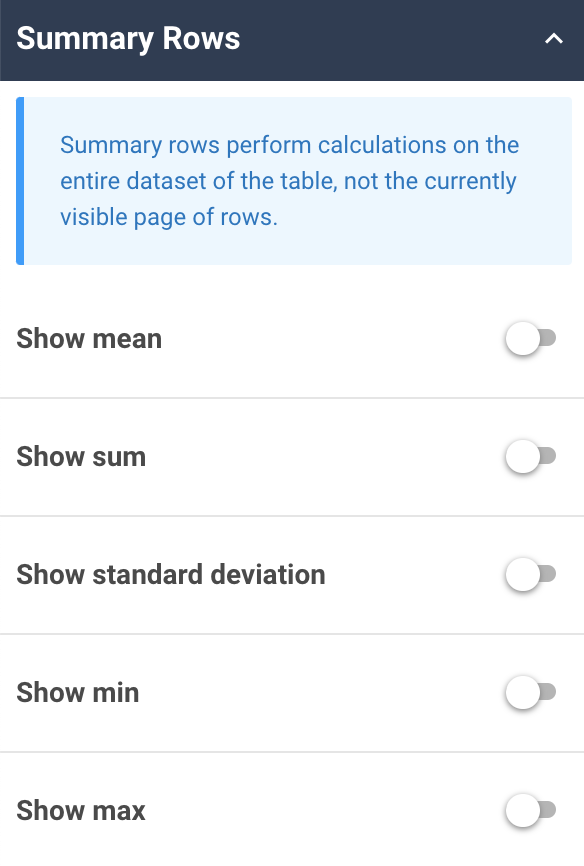
Use the Summary rows properties to display any aggregated values you’d like to see for the table. The aggregated values are calculated based on the entire content of the table, including any rows that are paginated.
Style

You can use the table Style properties to alter the appearance of your table cells and rows. These settings include text and cell colors, font size and cell padding.
Avatar settings
If you want to include pictures, you can use the Avatar settings to display the image associated with each user’s account. The avatars will be added to whichever column you choose in the properties. You can also opt to only display the avatar (and hide the column value), and adjust the size of the avatars.
Sorting
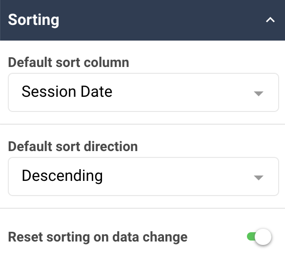
The column Sorting properties can be used to choose a default column for sorting purposes (ascending or descending). If you want your default sorting choices to be re-applied after someone interacts with your dashboard (for example, choosing a different athlete from a select box widget that is acting as a filter for the table data), then you can leave the sorting reset enabled.
Interaction
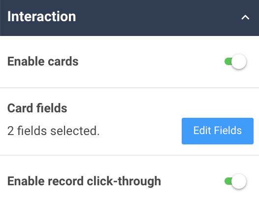
If you want to provide users with more information about the data displayed in a table, you can set up different interactions using the Interaction properties.

You can use the Interaction properties to add more details about the data represented in the widget using a record card. When people select the widget, the card fields that are set will be shown in a pop-up screen.
If multiple records are aggregated to create the widget's value, a list of records that contribute to the displayed value will be shown. When a specific record is chosen from that list, the record card is shown.
You can configure the record card with any fields that you think will help your dashboard readers understand the data and get maximal value from it. If you don’t choose any specific fields, the record card will show the field of the series being displayed.
If you want your readers to be able to view or edit the record previewed in the record card, then you can use the interaction properties to enable record click-through. This toggles a button to go to the record from the record card. The dashboard reader would then be able to view or edit the source data, according to their data permissions. When they save their changes to the record and close the form, they’ll go back to the dashboard. The dashboard will refresh at this point to be able to show the reader the updated data. This property can only be enabled when the record card property is also enabled.
Advanced properties
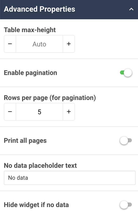
Use the Advanced properties for customizing your table further. Advanced properties for the table widget allow you to:
- Specify a max height for the table (measured in pixels).
- Apply pagination and rows per page.
- Print all pages (ensures all data will be printed, even if pagination or a max height is set).
- Customize the placeholder text that’s displayed when there is no relevant data.
- Hide the widget if no data is available (based on data source and filter settings).
Data preview

The table widget has properties that allow you to choose how you want to preview your table. When using the dashboard builder, you’re not able to view real data entered by athletes, coaches or other users of your Teamworks AMS site. So the dashboard builder shows you simulated data in order for you to see how your table might appear.
Trellis

Use the Trellis properties to conditionally display the Categorical chart multiple times based on a field within a data source. To customize your trellis, you can:
- Set Filters for the data you use to create the trellis.
- Set a Limit of how many multiples of the trellis should be displayed.
- Choose to keep the category order consistent for all multiples.
- Choose whether to order the trellis by Values, Date of first occurrence, Date of last occurrence or a Custom order. You can then set the order Direction to be Ascending or Descending.
- Choose whether to display the title of each multiple (this is based on the trellis Field selected). If you enable this, then you can specify the font size, font color and text alignment.
To learn more, check out our article on Widget Trellising.